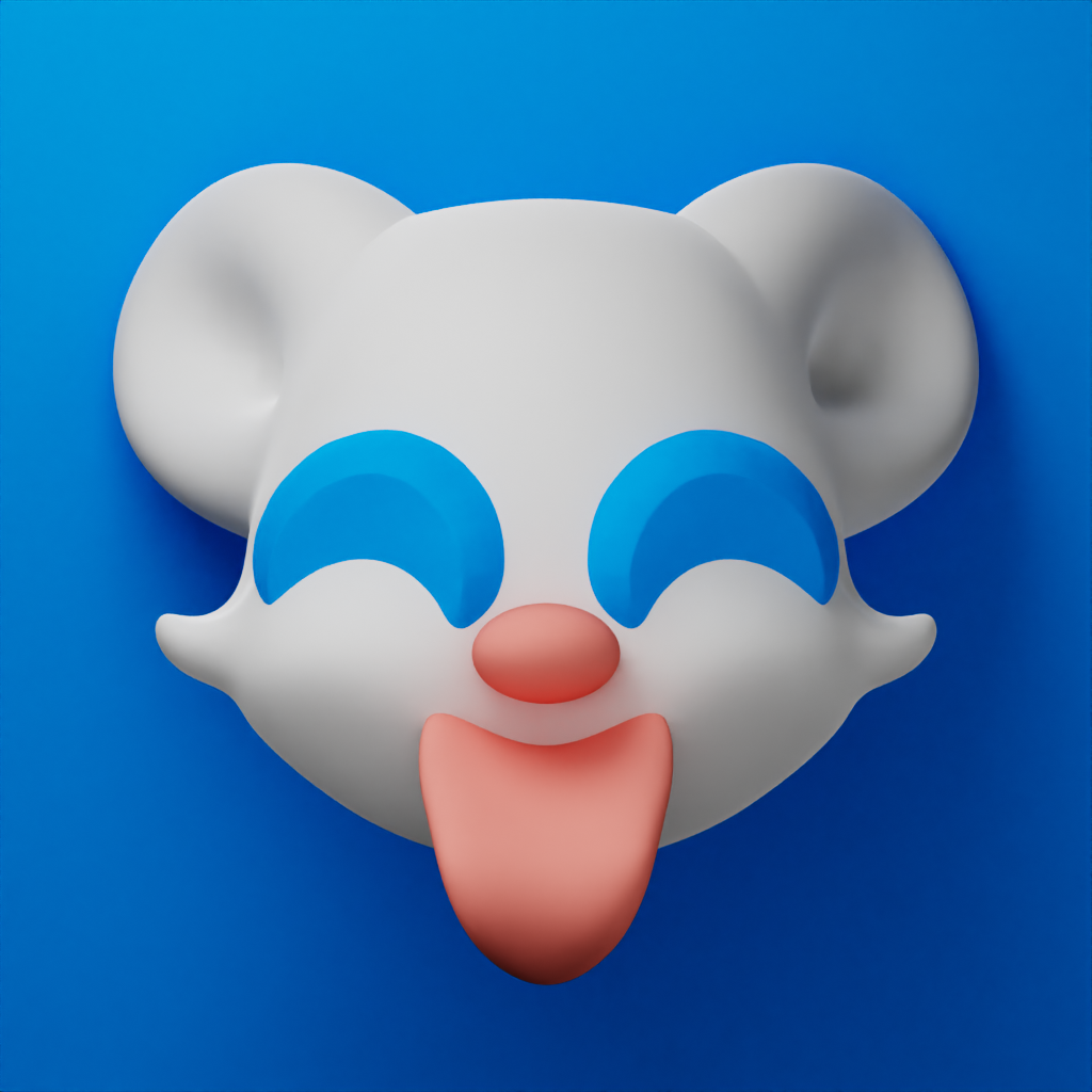
Main takeaway: I like it a lot, greatly prefer it over the current one.
Minor suggestions:
Perhaps scale down the tongue. It’s a bit overwhelming.
I think the eyes should be a different colour, they’re a bit close to the background which with them them so big makes the eyes blend in. Typically you want eyes to be …well… eyecatching! Though I’m not sure what to suggest as you don’t want too many colours on the icon.
Personally I prefer flatter designs, but I don’t really mind a more skeuomorphic design.
Also I am not a designer, so ignore me with my blessing haha