I think I accidentally posted into the wrong thread somehow, this is not the thread I was in when I typed my previous reply. Or did OP edit title/post while I was replying? Because one of the responses I am seeing is the same.
Zagaroth
Electronics Technician, geek, happily married, and an aspiring author. Come check out my serial, “No Need For A Core?”
- 0 Posts
- 10 Comments
Yes, it is my first time, no, I did not know that and created a Mastodon account separately once I heard of it.
What exactly is “fediverse” anyway?

 1·1 year ago
that worked, thank you :)

 6·1 year ago
FFXIV, most of the writing subs, Another Eden, I don’t think FoundryVTT has moved yet, PF2E, there aren’t nearly as many cute-animal communities yet, etc.
Windows, it’s easy to set up all the games I want and I’d have to run an emulator to use a Linux distro and still play everything I want to.
The last version I paid for was Windows 7 however, I only took the Win10 upgrade when things slowly stopped working because of driver issues.

 9·1 year ago
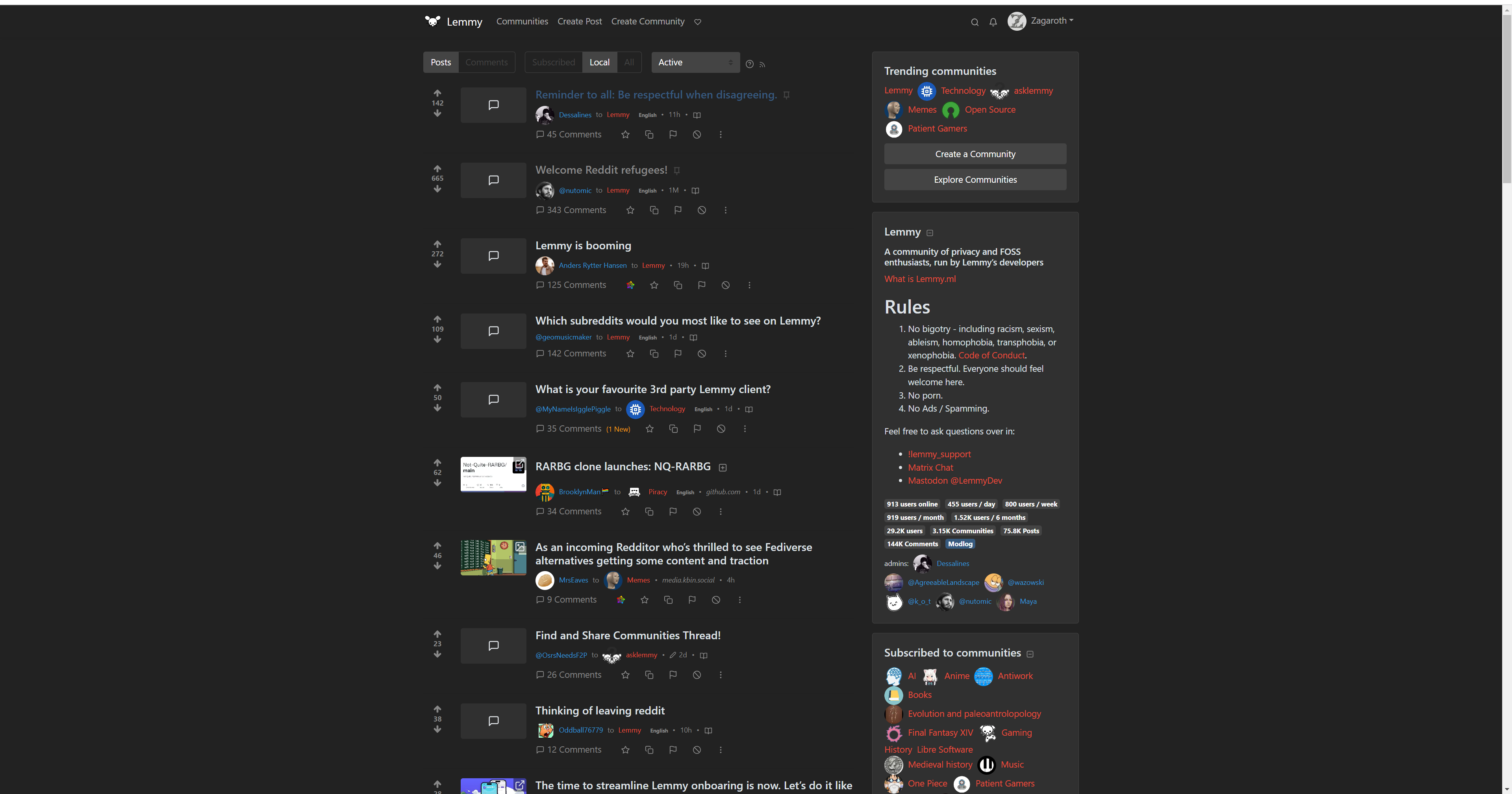
So, might I recommend having a button on the top bar that shows us the instances we’ve subscribed to, and maybe a quick link to the list of available instances? People like easy navigation, having to do multiple bookmarks or navigate through finding a link to the list of servers is not easy navigation.
I think it should look a bit more like old.reddit + RES (though not a copy). Pretty much if the choice is between looking more like old.reddit + RES or looking like new Reddit, go with the old.
Some specific issues I am seeing:
Half my screen is dead space, and why is the sidebar right up against the main column of text?

Extraneous stuff should be right (or left, depending on layout) justified, putting space between the main content and the sidebar. Also, let the center column be wider if someone has a wider screen.
I would like to be able to expand text or images without going all the way into the post. Basically, push everything else down and show the post, but leave the user on the front page and don’t load the comments.

 1·1 year ago
What’s wrong with helping a country defend itself from invasion by imperial warmongers?
And to be clear, yes, I am calling Russia imperial warmongers. They have been actively invading neighboring countries for decades to expand themselves. And what is an empire if not a nation built on the conquest of other countries?

 21·1 year ago
Supporting Ukraine is the only U.S. military action since WW2 that I can truly support. Even our action in response to 9/11 was fucked up.
Okay, I wonder if my feed was mixing threads up, because after I replied it looked like I was in a thread with a title about asking what features you like in Lemmy vs Reddit, with the text field of the question saying that they especially loved the fact that titles could be edited, so I was left confused.